
We’ve all seen this go wrong, and sometimes it’s hard to tell why, something just looks a little…wonky? I’m here to help.
So you’ve bought a beautiful piece of art, you’ve hung it on your wall, and it doesn’t look quite right. Should it go up, down, left, right?! Consider these guidelines below, and it will be looking better in no time!
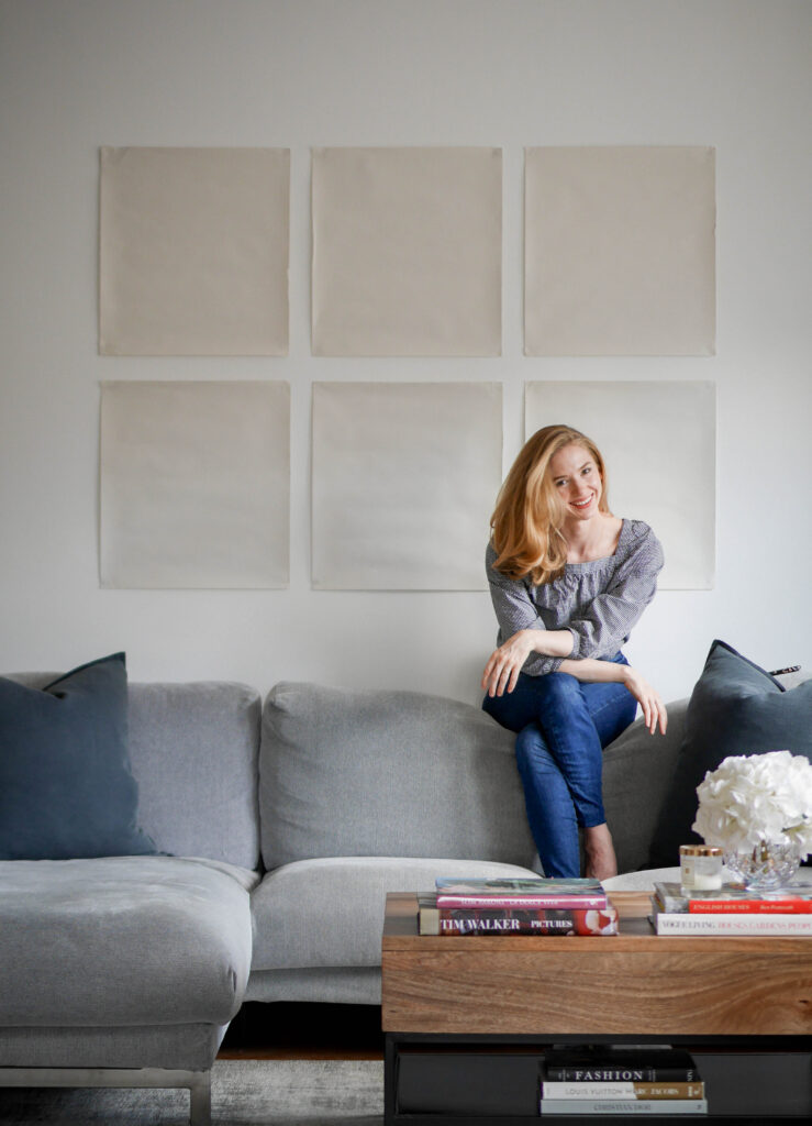
1. Furniture
Art should be hung in relation to the furniture – not the ceiling! About 20 cm above the piece of furniture. If you hang the art in relation to the ceiling it will be wayyy too high! Yes, even if you have high ceilings.
2. Eyeline
No furniture? No problem! People often forget that art is there to be viewed. When looking directly at the picture, you should be looking at the middle of the piece of art (or perhaps a little below) – so the centre should be about 145 – 150 cm off of the floor.
3. Space Zoning
When you have an open plan space it can be even harder to get your positioning right. Should you hang your art in the middle of the wall, even if it’s in the middle of two ‘zones’? The answer is no. Treat each zone like a separate room, and hang your art in each space. Each space should have it’s own identity, and your art will help you achieve that.
4. Test it!
A great way to be sure you’re getting it right is with paper and Blu Tack! Cut out a piece of paper the same size as your frame and try it out on your wall. Move it around until you think it’s right, and then leave them up for a week! It takes a few days to adjust to something new in your home, but after you’ll know if it looks right, or needs more adjusting.
Do you find hanging art overly stressful? Or perhaps you have some top-tips for art positioning? Let me know in the comments – I would love to learn from you!
Looking for some inspiration? I love these pieces below – the maps are now hanging in my living room!


